You made something that tasted incredible, held up your phone, took the shot — and the photo looks like cafeteria food. The colors are dull, everything looks flat, and you genuinely cannot tell why it looks so unappetizing when the real thing was right there in front of you.
It’s not your cooking. It’s not your phone. It’s three or four small decisions about light direction, angle, and framing that are quietly working against you — and once you see them, you can’t unsee them.
The good news: you don’t need a ring light, a DSLR, or a photography degree. A window, the right angle, and a little distance from your subject will do more than any gear upgrade.
Why shooting under overhead light makes food look dull
Think about the last time you took a photo of dinner on your kitchen table. Ceiling light on, plate in the middle of the table, phone pointed straight down. The food looked fine in real life. In the photo, it looked somehow wrong — flat, a little lifeless, nothing like something you’d want to eat.
That’s not bad luck. It’s the light.
When light comes directly from above, it hits every part of the food at the same angle. The sauce, the raised edges of the pasta, the crispy bits on top — they all get the same amount of light. No part is brighter than another. No part is darker. And that’s exactly the problem.
Shadows are what make surfaces look real. They’re what your eyes use to understand that something has texture, height, and shape. Take those shadows away and food stops looking three-dimensional. It looks printed on the plate.
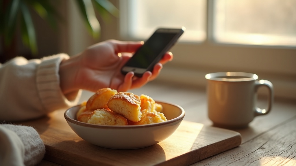
Now picture the same bowl of pasta sitting near a window, with light coming in from the side. Suddenly the ridges on each piece catch the light differently. Some parts are bright. Some dip into shade. You can almost feel the texture just by looking at it. The food looks like food again — something with weight and warmth, something worth eating.
Nothing changed except where the light was coming from.
How to position natural light so food looks its best
The single most useful thing you can do is move your plate to a window — and then think carefully about which side of the plate faces that window.
If you stand with the window behind you and shoot toward your food, the light hits everything straight on. Shadows disappear. The bowl looks like a flat circle. The sauce looks like a colored blob. This is the same problem as photographing food under a ceiling light — everything gets washed evenly and nothing pops out.
Now try placing the plate so the window is to one side of it. Suddenly the raised edge of the crust catches light. The near side of a bowl goes slightly darker than the far side. Those small differences in brightness are what make food look like it has shape and texture. Your phone’s camera picks this up beautifully, even without any fancy settings.
Back-lighting works even better for some dishes — especially anything with a glossy sauce, a drink with bubbles, or food with translucent layers. Put the window behind the plate, shoot toward it, and that light catches the edges and surfaces in a way that feels almost warm and inviting.
One practical note: direct sun streaming through the window actually makes this harder. The shadows become too sharp and the bright spots blow out. An overcast day, or a window that gets indirect light, gives you softer shadows that are much easier to work with. If your kitchen only has harsh direct sun, try moving the plate just out of the direct beam — even a foot to the side can make a real difference.
The light doesn’t move. You move the plate.
Choosing the right shooting angle for different foods
Most people hold their phone directly above their food and shoot straight down. It feels natural, like you’re looking at the dish the way you would at a table. But that overhead angle only works for certain foods — and for a lot of dishes, it actually flattens everything out and makes it look boring.
Flat lays are great when the food itself has an interesting layout — a grain bowl with colorful toppings, a pizza with distinct slices, a spread of small dishes across a wooden board. From above, the arrangement becomes the whole point. But if your dish doesn’t have much going on at the surface level, that straight-down shot has nothing to show.
For anything with height — a thick burger, a slice of layered cake, a stack of pancakes — shoot at eye level instead. Get low and shoot straight across. Suddenly you can see all the layers, and the food looks like something worth eating.
Most everyday meals sit somewhere in between. A 45-degree angle, roughly from the side and slightly above, tends to work well. You get a sense of depth without losing the top of the dish entirely.
Here’s where your phone actually works in your favor. When you get close and shoot low, the wide lens exaggerates the height of whatever is nearest to you. A burger looks towering. A stack of pancakes looks generous. That slight distortion — the kind that frustrates people in other situations — is exactly what makes food look dramatic and three-dimensional. The trick is getting close enough to use it.
How to create depth when your phone cannot blur the background
Here’s something that frustrates almost everyone who tries food photography on a phone: the background stays stubbornly sharp. You see those dreamy, blurry backgrounds in professional food photos and wonder why yours looks like a crime scene inventory instead. The honest answer is that smartphone cameras are simply not built to blur things the way larger cameras do. But that doesn’t mean your photo has to look flat.
The trick is to stop chasing blur and start building layers. Place something in the foreground — a fork resting at the edge of the frame, a folded napkin, a glass that’s only half in the shot. It doesn’t need to be blurry. Just having it there, closer to the lens than your main dish, gives the eye a sense of distance to travel. Front, middle, back. That journey is what reads as depth.
Your angle matters too. Instead of shooting straight down from above, try getting physically close to the food and angling your phone slightly upward. When you do this, the background naturally moves further away from your subject, and the foreground element you placed there starts to separate visually. The layers become more obvious without needing any blur at all.
Think of it less like photography and more like arranging a small scene. The phone is just recording what’s already there. If the scene has depth, the photo will too.
Why your background matters more than you think
Your eye is always looking for edges and contrast. That’s just how vision works. So when you put a bowl of pasta on a busy printed tablecloth, your brain has to sort through dozens of competing shapes and colors before it even finds the food. The food stops standing out. Everything flattens into one noisy surface.
Shiny backgrounds make this worse. A glossy white countertop reflects light back at the camera. A lacquered tray bounces highlights everywhere. The phone’s sensor picks all of it up, and suddenly the food is fighting its own surroundings just to be seen.
Matte, neutral surfaces fix this without any tricks. A wooden board, a plain linen cloth, a sheet of kraft paper, an unglazed tile — these give the eye somewhere to rest. The texture of the food reads clearly because nothing behind it is competing for attention.
This isn’t about keeping things bare or boring. It’s simpler than that. The background should be quiet enough that your eye lands on the food first and stays there. If you find yourself noticing the surface before you notice what’s on it, that’s the problem right there.
How color and freshness affect how appetizing food looks on camera
Your brain fills in a lot of gaps when you’re standing in front of a meal. You can smell it, feel the warmth, and your memory does the rest. A camera can’t do any of that. It only captures what it literally sees — which means the visual cues in the frame have to carry everything.
Color contrast is one of the easiest ways to make food look alive. A pale risotto on its own can look bland in a photo, but add a few torn green herbs or a wedge of lemon and suddenly there’s life in the frame. It’s not about decoration — it’s giving the camera something to work with.
Freshness shows up on camera more than people expect. A fresh drizzle of olive oil catches light. Steam rising from a bowl signals heat and immediacy. A just-cut surface on a piece of meat or a broken egg yolk looks vivid and real. The same food left out for ten minutes starts to look dull — surfaces dry out, sauces settle, colors flatten.
So photograph the food the moment it’s ready. Not after you’ve served everyone. Not after you’ve taken a bite. That small window — right when it comes off the heat or out of the pan — is when a smartphone camera will make it look its best. After that, you’re working against yourself.
What to adjust when editing — and what to leave alone
The most common editing mistake with food photos is trying to make them look more exciting than they actually were. More saturation, more brightness, more everything. The result looks fake — and fake-looking food is deeply unappetizing.
Your phone already captures color reasonably well in good light. What it struggles with is depth. That’s where a small bump in contrast actually earns its place. It brings back the slight difference between light and shadow that makes food look three-dimensional instead of flat.
Shadows are worth adjusting too — but gently. Lifting them a little can reveal texture in things like bread crust or salad leaves that the camera quietly buried. You’re not brightening the whole image. Just opening up the dark areas enough to show what’s there.
If the photo looks too orange (common with indoor light) or slightly blue (common on overcast days), fix the white balance before you touch anything else. That one correction often makes everything else unnecessary.
Beyond that, leave it alone. The goal isn’t a dramatic edit. It’s to make the photo look like what you actually saw — the food as it sat in front of you, in that light, at that moment. When editing does its job well, you can’t tell it happened.